
Writing Accessible Posts
This short guide goes over several aspects of accessibility to keep in mind when writing or editing posts on the Codidact network. There are many different disabilities out there, and these tips cover accessibility for many of them, such as people using screen readers, keyboard users, colorblind users, and people with cognitive disabilities.
Table of Contents
Formatting
Headings
Headings are used to separate sections of information. Each heading should give you a decent indication of what you can expect in that section. (As an example, the heading "headings" before this section is a good hint that this section is about headings.)
-
Follow an intuitive header order.
Don't jump from an
<h2>to an<h5>; follow a consistent, intuitive order for headings, where top-level sections have a higher-level header and sub-sections have a lower-level header. You shouldn't skip levels of headings (for instance, moving from an<h2>to an<h4>without an<h3>in between)
However, when you are ending a sub-section and moving back to a higher-level section, you can move from a low-level header (such as<h4>) back up to a higher-level header (such as<h2>) without including a mid-level header. -
There should generally only be one top-level header (which can be formatted using
<h1>or#) per-page.Posts on the Codidact network have a top-level heading as the question or article title.
Whether or not using another top-level header is appropriate depends on the type of post you're writing, as well as on how the question and answers are structured. Posts covering a large number of topics or that are split up into multiple, entirely distinct sections sometimes might need to include more than one top-level heading, but consider carefully if it's actually necessary. -
Only use headings for actual headings, and don't use headings for non-header content.
If something acts as a heading, it should be properly marked up as a heading, using either the appropriate Markdown or HTML tags. The opposite holds true as well; if something is not acting as a heading, it should not be formatted as a heading. If you want to emphasize something, don't use headings to do that.
Screen readers and similar can jump from heading to heading (including describing what level of heading), so keep that in mind when choosing headings for your posts.
Examples
A good heading order follows the logical layout of the page, without skipping over levels, consistently uses the same level headings for sections at the same level, and only uses headings for actual heading content.
// Example of a good heading order
<h1>Question title (automatically provided)<h1>
<h2>Answer section 1</h2>
<h3>Answer sub-section 1a</h3>
<h3>Answer sub-section 1b</h3>
<h2>Answer section 2</h2>
<h3>Answer sub-section 2a</h3>
<h3>Answer sub-section 2b</h3>
<h4>Answer sub-sub-section 2b.1</h4>
<h4>Answer sub-sub-section 2b.2</h4>
<h2>Answer section 3</h2>
The heading order above shows an answer that doesn't use a top-level heading (<h1>), since there's already one on the page - the question title. It uses <h2> to differentiate its high-level sections. It then uses <h3> for the sub-sections, and when it's necessary to have a sub-sub-section, it uses <h4>.
A bad heading order would skip levels, use headings for non-heading content, or unnecessarily over-use top-level headings.
// Example of a bad heading order
<h1>Question title (automatically provided)</h1>
<h1>Answer summary (actual content)</h1>
<h3>Answer section 1</h3>
<h5>Answer sub-section 1a</h5>
<h4>Answer sub-section 1b</h4>
<h2>Answer section 2</h2>
<h4>Notes</h4>
<h1>Thank you for reading!</h1>
This bad example uses <h1> twice in the answer, despite there already being a top-level heading as the question title. It uses an <h1> heading for the answer summary, using a heading for non-heading content. It then uses wildly inconsistent heading levels for its different sections and sub-sections, and skips levels of headings (such as moving directly from <h3> to <h5>).
Emphasized text
Emphasized text, such as bold or italics, is good for calling attention to key words or sentences. However, if it's overused, it ends up defeating its own purpose and making a post more difficult to read instead of clearer.
-
Bold text should be used sparingly.
Only use it to highlight words or sentences that actually need special attention called to them.
-
Italics should only be used when it is appropriate to use italics.
Italics are used for emphasizing stress on a certain word, italicizing the names of works, indicating words in foreign languages, and other standard uses of italics. Don't over-use italics on text that doesn't need to be italicized; remember that italics can make it harder to read the text for certain people, including some people with dyslexia.
-
Avoid bolding or italicizing entire paragraphs.
Code markup
-
Code markup should be used for code, including variable names and other code elements that may be found in non-code lines.
This allows for code highlighting to work, and makes it clear when a code element is being referred to.
-
Code markup should not be used for any non-code elements.
This includes using it for emphasis, for tables, or other non-code usage. Instead, use the dedicated formatting for those elements. Misusing code markup can cause issues for assistive technology such as screen readers.
Text size
-
Don't stack subscripts or superscripts to make your text tiny.
Using superscript or subscript once is enough, and only use it when necessary. Screen readers may not differentiate between sub- or superscript and regular text, so keep that in mind.
Codidact has integrated footnotes available, so you should avoid using sub- and superscript for footnotes; use the dedicated Markdown instead.
Tables
-
If possible, avoid putting ambiguous data into tables - i.e., having data that you can't tell which column of the table it would be associated with without checking, such as having two columns containing plain numbers.
-
Avoid blank header rows in tables, and don't use table formatting for data that doesn't actually belong in a table.
Images
Alternative (alt) text
-
Whenever you include an image in a post, you should include alternative text (commonly called "alt text") that serves the same purpose as the image.
This replaces the default text of "Image_alt_text". This is used by screen readers, search engines, and when images can't be displayed (such as images being blocked in certain countries or by school/business networks).
-
The alt text should be short, succinct, and serve the exact same purpose as the image - it shouldn't contain more or less information than the image itself.
As a general way of making sure your alt text is appropriate, consider if the information present in the post would change at all if the image was replaced entirely with the alt text. If the information would stay the same, you're good to go.
Decorative images
- A decorative image, which serves no purpose other than visual, should have its alt text be entirely blank.
Note that this is blank, not missing. From a coding perspective, this means setting its alt attribute to ="", not leaving out the alt attribute.
In general, you should avoid including images that don't serve any specific purpose or that are just decorative in your post.
If you find yourself including a decorative image, make sure that it's not formatted as a link, leaving only the embedded image, and to set the alt text to be blank.
Stable resource (local images)
In order to avoid the possibility of dead images, and ensure that that post remains stable for as long as possible, you should avoid using an external image hosting service. Instead, use the built-in image uploader for the Codidact Network. This means that the image is stored on our own servers instead of depending on someone else.
Examples
Let's take the following snippet of a post for our example:
When you go to edit a post, you now have the option to check the "redact" button:
(Source: "What should I do when I come across PII in a post?" by Mithical on Codidact Meta, licensed under CC BY-SA-NC 4.0)
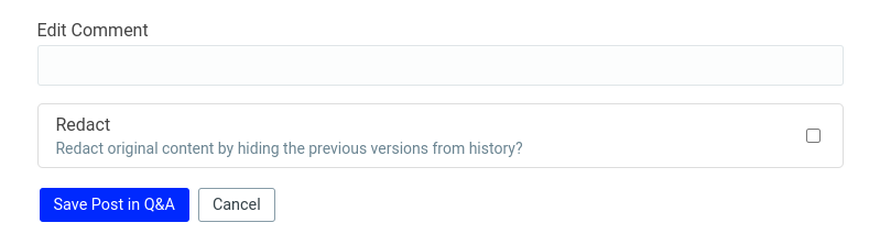
In this example, the image is being used to illustrate the new button and what it does. That information needs to be presented in the alt text as well, which the current alt text does:

This is short and to the point. It tells anybody who can't see the image what information is shown with the checkbox, which is why the screenshot was included.
A bad example would be leaving out the alt text, having overly long alt text, or relying on an external image hosting service:


In the first bad example, there is both no alt text and it relies on an external image service. There is no information presented to anyone who can't see the image, and there's the risk that the image will go dead even for people who can see it.
In the second bad example, the alt text is too long. It has information that's not present in the image itself, such as information about the edit comment appearing in the revision history, and describes information that's not relevant to the purpose of the screenshot - which is simply to show what you're presented with when you go to redact a post.
Don't rely solely on color
When your image uses colors to indicate a difference between things - such as on a chart or graph - you should also use a different method of differentiating, such as an icon or different shape. Also avoid using colors that are known to be a problem for colorblind users (such as red/green).
Contrast
Avoid colors that are too close to each other, especially for text on a background color. As a simple way of testing, take a glance at the image in sunlight - can you still make it out?
Animations
We don't currently support any way to disable or pause animations in posts, so avoid using animations where possible. In particular, make sure to avoid flashing content (especially anything flashing more than three times a second - don't do that!). Flashing content can cause seizures, and looping animations can be distracting for everyone, but especially for people with some cognitive disabilities.
Images of text
-
Avoid images of text.
Images of text can't have the text selected, be read by screen readers, indexed by search engines, have the text adjust in a responsive design, or have the font changed. This includes images of code; instead, put the actual code in your post and format it using the dedicated code formatting Markdown.
Quoting
-
If you are quoting from somewhere, don't provide an image of the text; use text, formatted as a blockquote (which can be done by putting a
>at the beginning of a paragraph), and cite your source.This applies to both online and offline resources, such as Wikipedia or a physical book.
-
Do not use code formatting for quotes.
Links
Link text
-
Avoid link text such as "Here" or "Read more".
The link should explain its purpose through the text itself. Remember that screen readers and similar tools can jump to specific links, but if they're named something like "this", navigating to the correct link is much harder.
Don't go too far in the other direction, though; there's no need to make an entire sentence a link as long as the link text is descriptive and distinct. -
In general, link text should be unique - don't use the same link text twice in one post if those links go to different places.
Stable resource (Web Archive)
While not required by any standard that I'm aware of, I'd encourage you to take steps to make sure that any resource you link to remains stable by archiving it in the Web Archive when you link to it. (This is similar to what Wikipedia does; sources used in articles are almost always archived so that a backup exists.)
Making your posts understandable
Vocabulary
-
In general, try to keep your vocabulary simple.
This doesn't mean avoiding all technical terms, or not using the correct terms for things, but don't use jargon or fancy words when it's not necessary. This makes it easier for people who don't speak English as their first language, or people with cognitive disabilities, to understand your post.
This should not come at the expense of precision or accuracy, though; keep your audience in mind. If you are writing for a highly specialized or technical audience, you shouldn't necessary shy away from using the relevant terminology; but if you're writing for everyone, using relatively simple terms is often a good idea.
Define acronyms and specialized terms
-
The first time you use an acronym, you should fully spell out what you're referring to.
A common example found on Codidact (CD) is just that - the acronym CD. However, that acronym can also refer to the terminal command
cd, or the physical medium of Compact Discs, as well as other meanings. Once you've defined what CD stands for in your specific post, you can continue to use the acronym.
This applies to specialized terms, jargon, and words in other languages as well. The first time you use a specialized term, define what it means or translate it.
Paragraph and sentence breaks
-
Avoid walls of text.
Make sure to break up your posts into sections, paragraphs, and sentences. When something runs on for too long, or is too dense, it can be very hard for people to get through, especially people who don't speak the language well or people with certain cognitive disabilities.
And those are the top tips for making your post accessible! Remember that accessibility is an ongoing process, so don't feel too bad if not all of your posts meet these guidelines. They can always be edited later, and the important thing is to keep accessibility in mind as you go forwards writing and editing posts.

0 comment threads